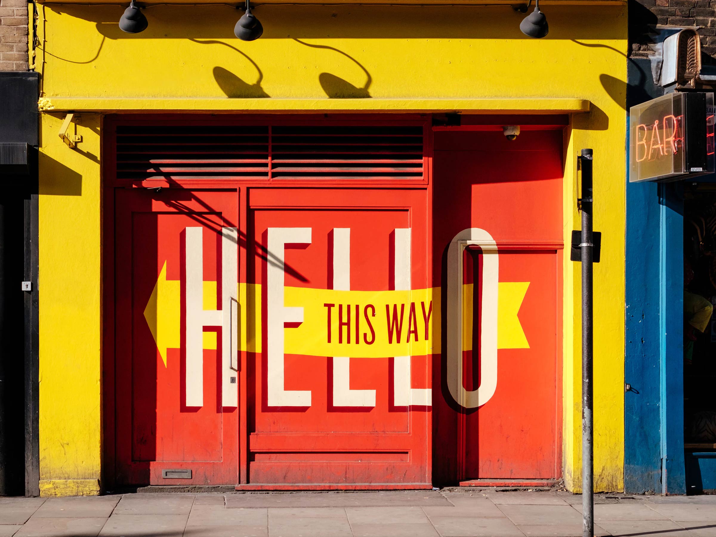
For a long time, typography and web design weren’t the best of friends. Designers used to have very little authority over what fonts the user would see when viewing a website. The choice of typefaces depended solely on the viewers’ browser settings and what fonts they had installed on their computers.
As a result, many corporate websites had to rely mostly on imagery to make an impression and many webpages often looked out of step with other brand touch points where the choice of fonts and typographic finesse could be relied upon to add personality and to communicate a brand as effectively as possible.
This all changed over the last few years with the introduction of web fonts and the ability to embed (or rather download) a wide range of typefaces into the code of the website.
Not only is it now possible to use your corporate typeface – rather than just a generic system font – on your business’s website, it has opened up a whole new world of creative uses of typography that go way beyond what’s ever been possible in print and could make your firm’s website stand out and more memorable.
We have trawled the web and compiled examples of some of the most engaging, inspiring and unusual typographic trends. Not all of them are corporate websites, but they might still act as an inspiration to what’s possible and what might be adapted to make your business’s web presence more engaging.
Gradients and image overlays
We increasingly see colour gradients applied to headlines. If fluid colour transitions are part of your brand’s visual language, this is a great way to integrate this graphic effect into the design of your website, especially on text-heavy pages. Or you can go a step further and make headlines, or even longer paragraphs of text, to act as a window into another world, by applying picture overlays to text.
Here are some examples:
Highlighted text
Do you still use a highlighter pen to pull out important information on a printed piece of paper? So do an increasing number of websites.
Examples:
Animated type
There are now many different ways to make text appear or move around on a webpage. You don’t want to apply such an effect to every headline, but here are some examples where animated text has been used to great effect.
foundationstejjustine website homepage
Louisana website homepage
Gutta website homepage
arche68 website homepage
nextembrandt website homepage
User interaction
For a really memorable web experience, it’s always a good idea to involve the user and make them interact with the design of a webpage. We found some examples where this has been applied to typography to great – and sometimes unexpected – effect.
We hope you’ve been inspired by these variations of typographic examples. The choice of typography for your website contributes to the overall design of your site. Now it’s time for you to start thinking about font styles that will be best suited for your website.
If you have any questions about digital design elements, and what it means for your website, get in touch with us here.


