CDC

Bringing CDC's flyers into the 21st Century

The Brief

Your mission, if you choose to accept it, is to “bring our flyers into the 21st Century! ”. The gauntlet was thrown, and Fin took up the challenge with relish. Here was an opportunity to merge print and digital skills, improve copy and deliver a confident graphic style to create modern, compelling Investor Communications materials.

Fin were briefed by CDC (the UK’s Development Finance Institution) to create a set of animated and interactive online materials; designed in full and taken through to html templates – each with a common visual thread, adapted for desktop, tablet, and mobile responsive use. The requirement for content was to clearly portray the message that CDC, (as a world leading, specialist ‘Impact Investor’), is 100% funded by the UK government; hence well capitalised with a strong heritage – having invested in sustainable ventures across Africa and Asia since 1948.

In areas where no-one else can, CDC provide value and growth for business – accelerating economic prosperity by utilising a breadth of investment products and partnerships. Therefore, their promotional ‘teasers’ need to be translatable and shareable – being very tightly targeted, yet easily accessible to CDC’s investment teams and potential clients across many regions.

CDC’s transactions are deployed in a socially responsible way and in alignment with the UN’s sustainable development goals. Combining the messages of ‘commercial undertaking’ and ‘social responsibility’; Fin’s aim was to help CDC win the hearts and minds of businesspeople – with a focus on long-term value and growth (patient and flexible capital), through a lens of climate and inclusion. To compliment written content, Fin were asked to deliver clear icons and graphics, revised illustrative diagrams and eye-catching photographic imagery to chime with existing brand guidelines.

The Response

Having recently worked with CDC on their pitch-book we had explored the boundaries of their brand guidelines and developed some useful insights into their multiple audiences and stakeholders. This allowed us to develop a swift process where we could hit the ground running.

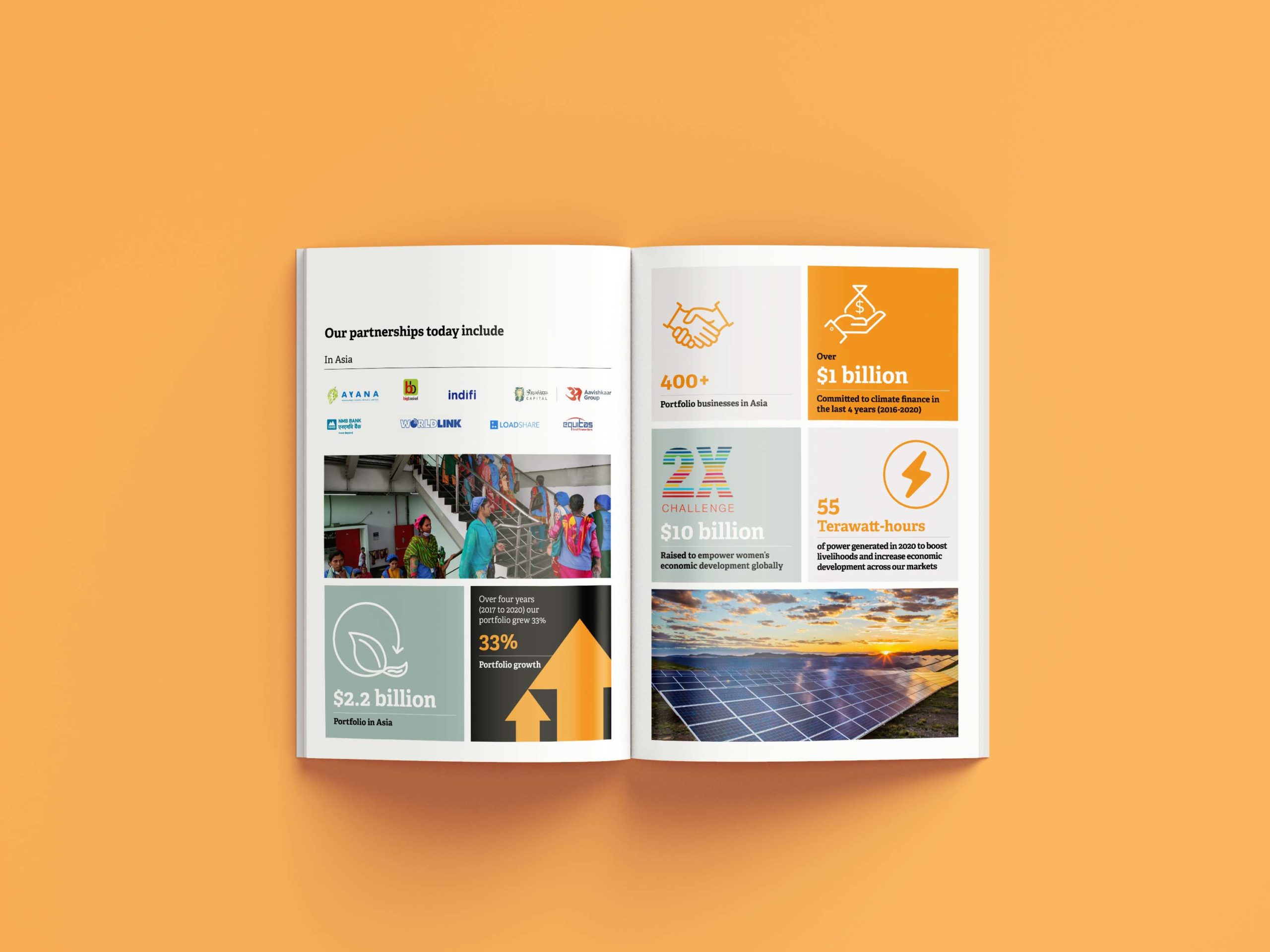
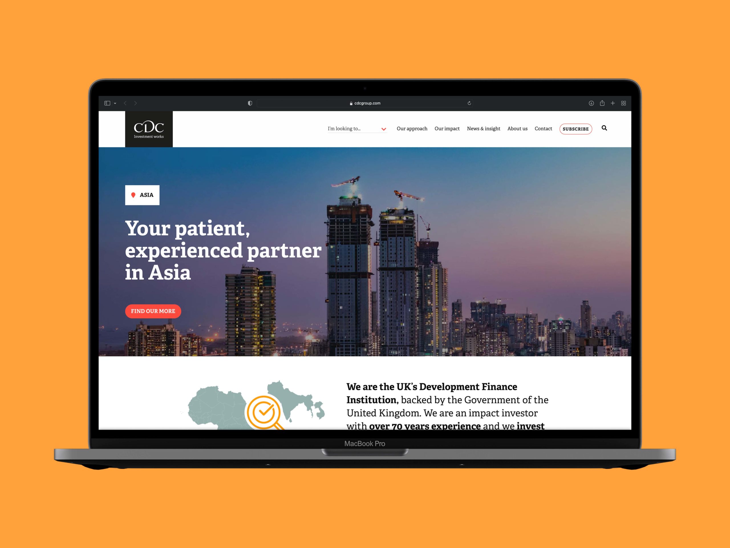
We proposed a linear design, to best fit within the framework of an interactive webpage, using Parallax Scrolling – a web design technique in which the background moves at a slower pace than the foreground, resulting in a 3D effect throughout. The body of the design was based on a series of graphic banners, with alternating colours for the different modules; each with bite-sized information to provide visual contrast, rhythm, and clarity to the user. Each banner graphic reveals itself in turn, as the user scrolls down the page, allowing for greater focus on each data point. Custom designed icons, animated infographics, smooth transitions, and the use of impactful imagery add further depth and rhythm for a more immersive browsing experience.

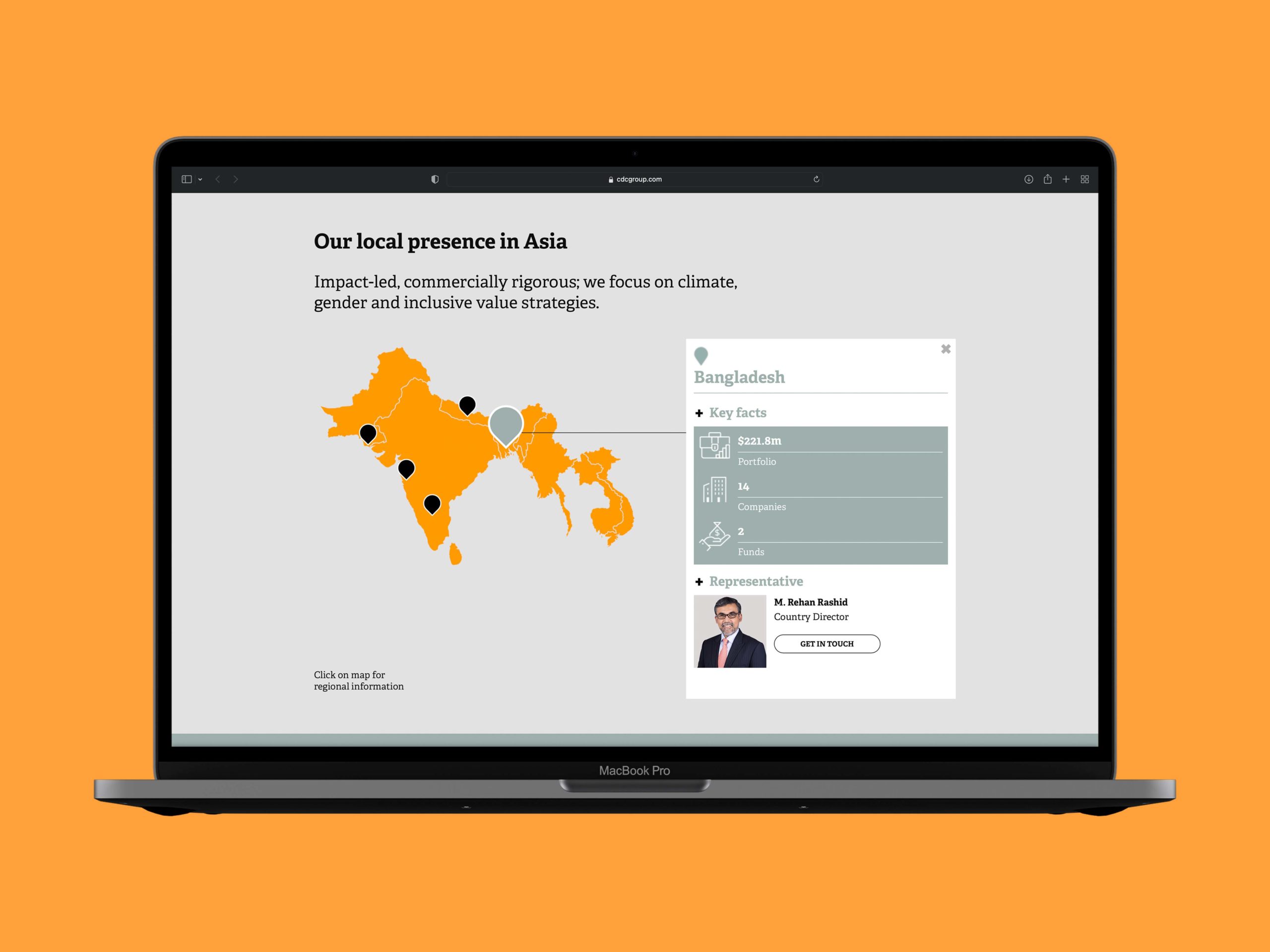
Being a series of initial ‘teasers’; hyperlinks within body-copy take the user to email pop-ups and existing web content for further information. Interactive ‘pinned’ maps, include roll-over functionality or ‘hover-states’, with information boxes displaying regionally specific investment information. And of course; we complemented the existing corporate site by incorporating CDC’s brand fonts, symbols, icon styles and colour palette – to align with their current visual language.

Fin advised that the online teasers be built to stand alone and remain private; yet be integrated into the CDC corporate site. In effect; it’s ‘one way traffic’. Each programmed page is accessible to the target audience via a private url; yet not listed/indexed by Google, and hence not searchable or navigable from the public website itself, or from any search engine. Recipients of an email communication (containing the link) can access the relevant teaser page; and navigate the rest of the corporate site if they so wish.

The Outcome.

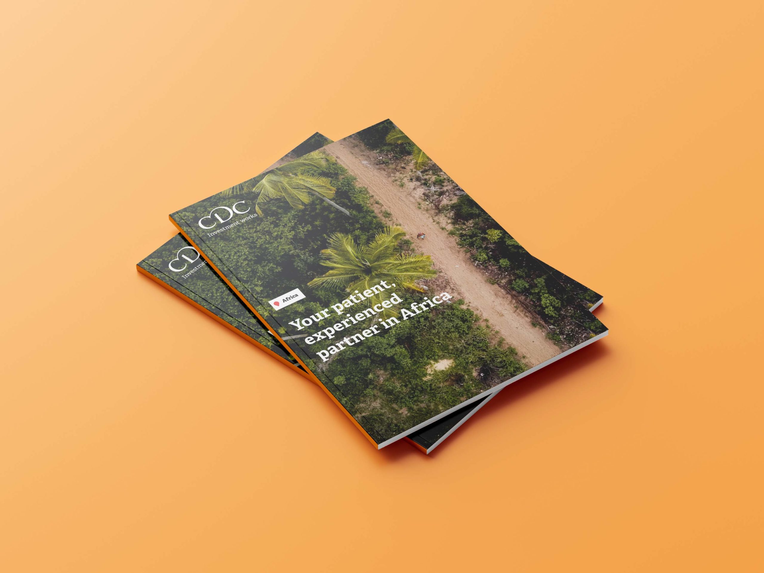
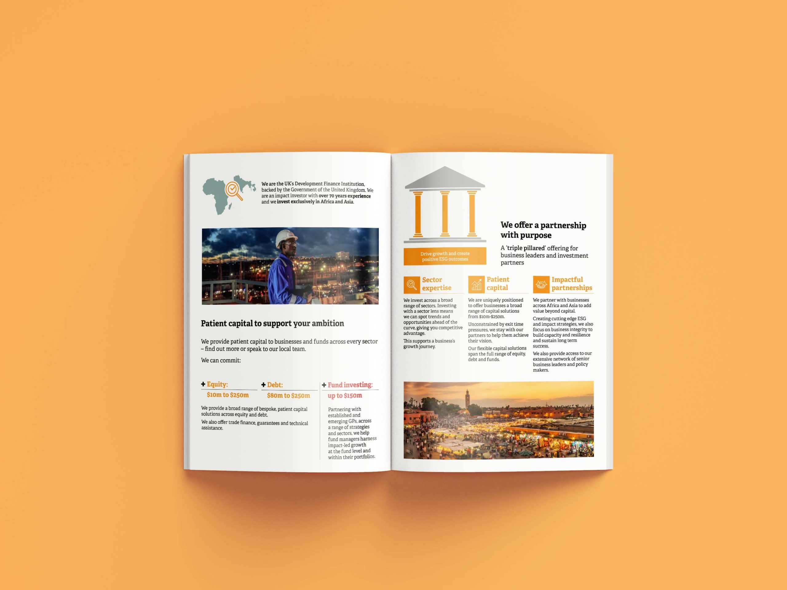
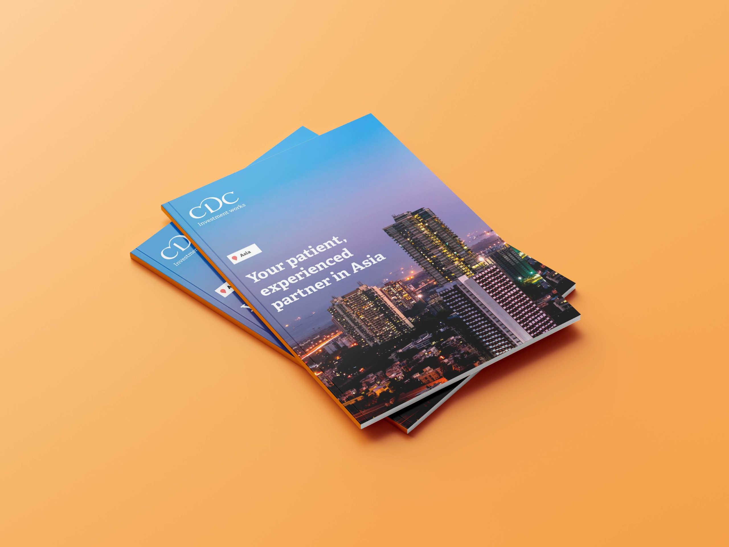
Our 21st Century teaser designs have been well received! Static, printable versions – uploaded as pdf files – now display as icons within the digital pages; and are downloadable for cross-market access prior to local events and pitches.

As the email campaign is rolled-out across regional investment teams and interested businesses; the option for data capture remains – whereby tagging and tracking code can be implemented online to facilitate data analytics.

Page-layouts created within InDesign and Adobe Illustrator, and latterly supplied as source files, allow for the in-house creation of sector or product specific pages; using our regional templates as ‘go-to’ design and programming formats.

Next project