The Pensions Management Institute, founded in 1976, is the UK’s largest and most recognisable professional body for workplace pensions professionals, supporting over 7,500 members across the UK’s leading pension schemes and providers to build and promote excellence within the industry.
The challenge
The Pensions Management Institute appointed Fin to revitalise their brand, encompassing their value proposition, visual identity, logo, and guidelines for implementing the new brand across member and support materials.
With minimal evolution of their brand over a number of years, their existing brand positioning, logo, and visual identity no longer aligned with their members’ focus, the pensions industry, and society at large. It was imperative for them to refresh their brand identity towards alignment with their members’ needs and the values of today’s society to demonstrate they were moving with the times.
Our solution
We began with understanding The Pensions Management Institute more deeply, its history, its concerns, its (and their members’) goals. We began this through reviewing all supplied background information, we then facilitated internal and external stakeholder interviews. This insight provided several key themes:
A need to have a position of a more worldly institute.
The word is continually changing, and they need to reflect a contemporary and socially aware institute.
Whilst their core role is providing qualifications, they also provide members with education on key issues affecting the pensions industry.
Their input creates a ripple effect from their members outwards to impact scheme members seeking financial security in retirement.
With a new member structure, they need to demonstrate an alignment with their members’ career pathway.
The full and formal name conflicted with the more usual and colloquial ‘PMI’.
We recommended on focusing brand usage away from the formal and lengthy ‘Pensions Management Institute’ to the more contemporary and much used shorthand of the ‘PMI’.
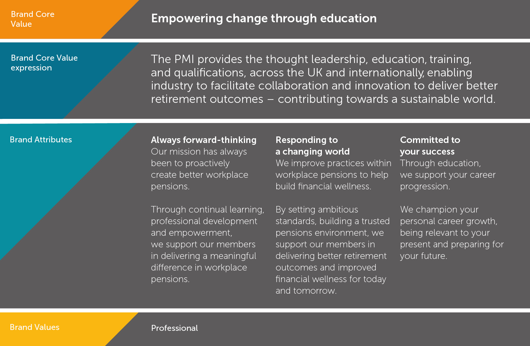
For the brand promise we focused on PMI’s impact on the workplace pensions industry, and beyond, through ‘Empowering change through education’.
The brand’s value proposition was encapsulated within a comprehensive message framework, showcasing their forward-thinking approach to the evolving landscape of workplace pensions, its impact on PMI members, and the beneficiaries of their members’ schemes:

