BNP Paribas Asset Management

Making sense of the universe: Evaluating the investor experience

Having successfully partnered with BNP Paribas AM to define the campaign proposition and creative concept in relaunching them as a leading ETF provider, in 2018 we were requested to help resolve the issues across their global ecosystem of over 80+ websites.


The problem

In 2015 BNP Paribas Asset Management (BNP Paribas AM) had successfully carried out a website redesign and migration of their 80 individual websites onto a single global platform. Four years later, rather than presenting a unified and cohesive user experience, the websites had begun to diverge in terms of their design, content and user experience.

They charged Fin to identify the reasons for this damaging divergence across so many sites. Our support was to be in two forms: as a short-term, tactical fix to halt the divergences, and a long-term strategic roadmap for development and consolidation of their digital ecosystem.

The audit resulted in a streamlining of the design, user experience and content of BNP Paribas AM's galaxy of sites

Our approach

To meet BNP Paribas AM’s two requests we designed a three-stage program of work:

  1. We undertook quantitative analysis of their websites’ strengths and weaknesses (UX, UI, content)
  2. We facilitated qualitative, global interrogation of the local businesses to identify the root causes
  3. We provided strategic consultancy to provide a long-term vision for ongoing development of the websites

1. Quantitative analysis

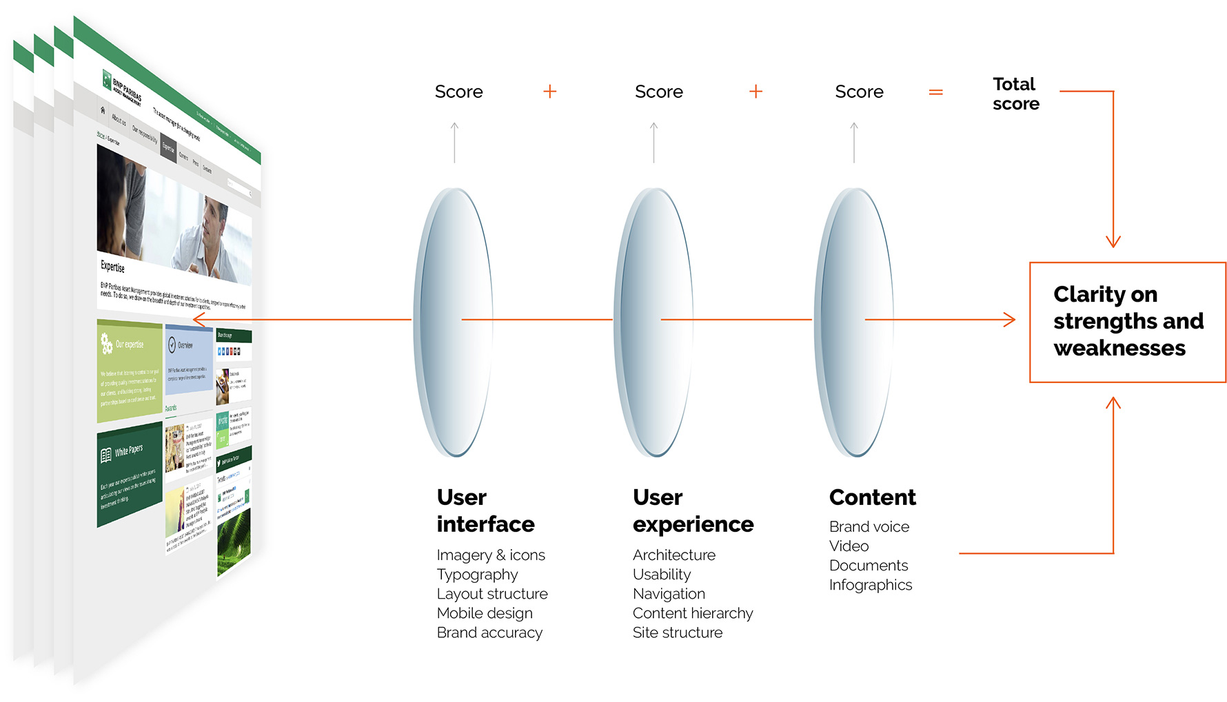
We assembled a team of specialist UX consultants, leading UI designers and investment industry brand strategists; each reviewed a representative sample from each of the three types of websites within BNP Paribas AM’s digital ‘galaxy’: Institutional, Retail, and Corporate. Our approach within the review was through a set of lenses allowing us to create a merit score which could then be applied, and compared, to competitors. The lenses we applied were:

  1. User Interface – covering: imagery & icons, typography, layout structure, mobile design, brand accuracy
  2. User Experience – covering: architecture, usability, navigation, content hierarchy, site structure
  3. Content – covering: brand voice, video, Documents, infographics

Key pages within each representative website across BNP Paribas AM’s digital galaxy were reviewed and individually scored by each team member in the context of each of the lenses. These scores were then presented to the wider Fin team for review and debate, then amalgamated into a total score for each lens. This same process was applied to matching key pages from within BNP Paribas AM’s nominated competitors’ websites.

The result

A clarity on the strengths and weaknesses through each lens across the evaluated pages and sites, then benchmarked against their competitors.

For those areas in which the scores were low we provided BNP Paribas AM’s internal digital teams with a range of quick-fix recommendations across UI, UX and content.

A very positive factor to come from our research was that, across the different lenses, we identified that whilst the UX, UI and content within BNP Paribas AM’s websites were not lagging behind their competitors, they were not surpassing the competitors. Through regular and variable inconsistencies across design, imagery and poor user journeys, the vast majority of BNP Paribas AM’s sites were under-performing.

Following BNP Paribas AM’s digital team finalisation of our recommended tactical quick-fix changes, we were appointed (in 2019) to repeat the same audit initially undertaken and measure the progress against the previous year’s findings. From the results it was clear that our recommendations had proved to be very successful:

2. Qualitative interrogation

In addition to the quantitative review we also undertook a qualitative review. Its goal was to provide a platform to the global marketing and digital teams in which to share their views as to why BNP Paribas AM ’s website galaxy had deteriorated so rapidly. This qualitative exercise was undertaken through interviews with internal stakeholder groups across the global locations of BNP Paribas AM. Each interview group was formed of people who were actively involved with the local websites or had day-to-day interaction with the website’s users or BNP Paribas AM clients.

Each group was invited to share and discuss their thoughts on the purpose of the local website, and whether this had been achieved. Using the same lenses as in the qualitative assessment we collected in-depth information about the perception of the website galaxy. This was through both an internal perspective and externally (through insight via client-facing staff) and included how the sites were performing against the global objectives of BNP Paribas AM.

Our findings formed the insight from which we created a strategic roadmap for a long-term redevelopment proposal of how to align each local site more closely with their immediate audience’s needs, and also alignment with BNP Paribas AM ’s corporate strategy of placing innovation and technology at its centre.

Our strategic roadmap provided a long-term plan that built on the current improvement of the BNP Paribas AM website galaxy (through our tactical, short-term fixes) to elevate the user experience through our advised specific initiatives such as the incorporation of robo-advising and live chat, a deeper focus on customer journeys to achieve specific conversion targets and content customisation by users to provide a more personalised experience.

The competitor landscape evolved at the same rate as BNP Paribas AM's 'galaxy' of sites

Conclusion

Having supported BNP Paribas AM since the 2001 merger between BNP and Paribas, we have had the privilege of delivering key projects of huge strategic importance to their asset management business. This latest project marks over a decade of a strong relationship between Fin and BNP Paribas AM.

Next project