Bringing your brand imagery to life

Creating a visual language to support your brand value proposition

Collage of client imagery representing Fin International’s visual storytelling approach.

You now have a wonderful, strategic brand core vale proposition which everyone thinks is on the money to say who you are and what you do. How do you now bring that to life in a meaningful and aligned visual way to take into key communication channels and collateral?

Fin has supported many clients to take their words into pictures and graphics, giving them the verbal and the visual tools to realise their brand across collateral both digital and print.

Aegon Asset Management

Aegon Asset Management is a global investment business who manage and advise on assets of $311bn.

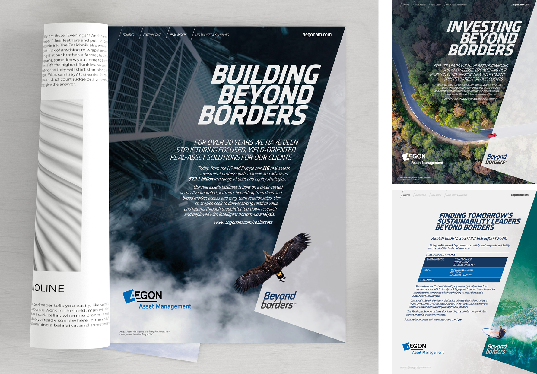
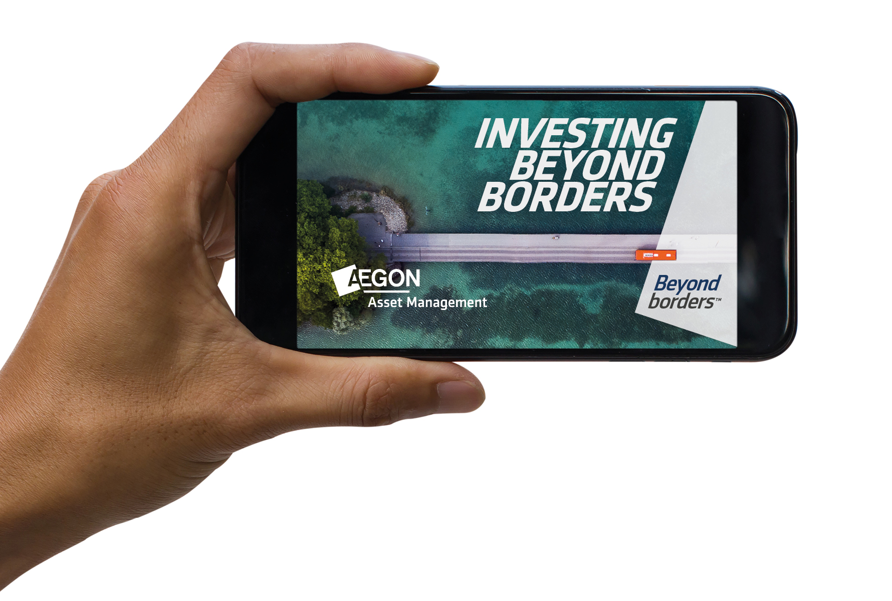
Fin supported Aegon AM on its brand repositioning exercise as the company undertook a global restructuring. We recommended a core value proposition of ‘Beyond borders’, which reflected Aegon AM’s goal of thinking and acting across geographical, cultural, and intellectual boundaries in a complex, interconnected world.

Our creative solution incorporates the 18.5° angle taken from Aegon’s brand guidelines to evoke a border through which Aegon is going beyond, to seek a better solution for their investors. Powerful aerial photography creates openness with a sense of exploration and open expanse for a broader and far-reaching vision.

We created both a range of Level 1 imagery for use in key collateral, plus a guide for development of Level 2 imagery (incorporating the visual angle) to be applied to everyday materials developed by Aegon AM’s global internal teams.

To view the full case study – https://www.fininternational.com/projects/aegon-aegon-asset-management

Aegon AM ‘Beyond Borders’ visual by Fin International, symbolising global connectivity.

Fin International’s main campaign image for Aegon AM’s ‘Beyond Borders’ strategy.

Aegon AM ‘Responsibility Beyond Borders’ banner

Fin International designed this banner for Aegon AM’s ‘Responsibility Beyond Borders’ campaign.

Aegon AM Level 2 imagery guide by Fin International, showcasing brand visuals for global teams.

Fin International developed Aegon AM’s Level 2 imagery guide, ensuring brand consistency across global materials.

Aegon AM ‘Investing Beyond Borders’ campaign displayed on a mobile screen.

Fin International’s digital campaign for Aegon AM’s ‘Investing Beyond Borders’ strategy.

Clearstream

Clearstream is a leading European supplier of post-trading services and is a wholly owned subsidiary of Deutsche Börse.

When dividing their main businesses in two areas: Clearstream Securities Services & Clearstream Fund Services, Fin was briefed to develop imagery to distinguishment between both sides within their communications collateral such as the website, events, brochures, advertising, pitchbooks, etc.

The business objective for Clearstream is to focus on innovation and to drive this forward. We developed a proposition of ‘Seeing further’, which was translated into an image theme featuring overlapping components of: colour panels (a colour for each of the two business areas), a hero image to reflect a key attribute of Clearstream, and futuristic light trails to present their visionary innovation. When combined these three components created an individual and unique visual styling across their collateral.

Clearstream ‘Seeing Further’ campaign visual by Fin International, featuring innovation-focused design elements.

Fin International’s ‘Seeing Further’ visual identity for Clearstream, emphasizing innovation and differentiation.

Clearstream ‘Seeing Further’ digital branding by Fin International, displayed on web and mobile.

Fin International’s digital branding for Clearstream, ensuring a cohesive identity across platforms.

Clearstream ‘Seeing Further’ campaign visuals by Fin International, showcasing innovation-driven branding.

Fin International’s creative branding for Clearstream, using futuristic design elements to highlight innovation.

BVCA

The BVCA is the voice of private capital in the UK, representing industry practitioners.

We created a new value proposition for the BVCA of ‘Invested in a better future’. Placing front and centre the focus on private capital being a force for good and its support of ambitious and driven teams to grow their businesses, whilst at the same time doing the right thing by our planet and society.

We created a visual language to be taken into their collateral. Our approach incorporated the today and the tomorrow by showing the business vision as a blueprint of the future, and the realisation of the vision within the hero image – business concept and success. We also created a ‘visual signature’ within the layout or imagery through utilising shapes with both curved corners and square corners, reflecting the new BVCA logo also created by Fin.

To view the full case study – https://www.fininternational.com/projects/bvca

BVCA ‘Invested in a Better Future’ campaign visual by Fin International, highlighting private capital’s positive impact.

Fin International’s branding for BVCA, showcasing private capital as a force for good.

BVCA ‘Invested in a Better Future’ digital and print branding by Fin International.

Fin International’s branding for BVCA, ensuring a cohesive identity across digital and print.

BVCA ‘Invested in a Better Future’ campaign visuals highlighting technology, environment, research, business, diversity, and change.

Fin International’s branding for BVCA, showcasing investment in technology, environment, research, business, diversity, and change.

Coremont

Hedge fund manager Brevan Howard opened up their renowned technology stack across front to back office to third-parties and start-up hedge funds. Fin was briefed to explore the name, logo, brand messaging, and brand visual language for this spin-off.

Our solution for the brand visual language is formed from three imagery approaches pending the requirement: people, abstract, and graphic. The core visual language is focused on the circles seen within the brand logo for the new name of ‘coremont’. Using these circles gave us a versatile visual device which could be taken into photographic as well as graphic, creating a contemporary and dynamic brand visual language, either as a central visual theme of background pattern.

To view the full case study – https://www.fininternational.com/projects/coremont

Coremont brand imagery by Fin International, showcasing people working together in a candid, natural style.

Fin International’s branding for Coremont, using candid imagery to reflect collaboration and innovation.

Coremont brand visuals by Fin International, featuring abstract textures and patterns integrating brand colours.

Fin International’s abstract imagery for Coremont, designed as dynamic backdrops for digital and print materials.

Coremont brand visuals by Fin International, featuring cut-out images of objects and people for design integration.

Fin International’s cut-out imagery for Coremont, designed for use with bracket device elements in branding.

Coremont brand identity by Fin International, featuring modern design across print, web, and mobile.

Fin International’s branding for Coremont, ensuring a cohesive identity across digital and print platforms.

If you want to review how your imagery can support your brand message, please get in touch for a chat by clicking here or call on +44 (0)7771 520193.

Justin Mould

Next project