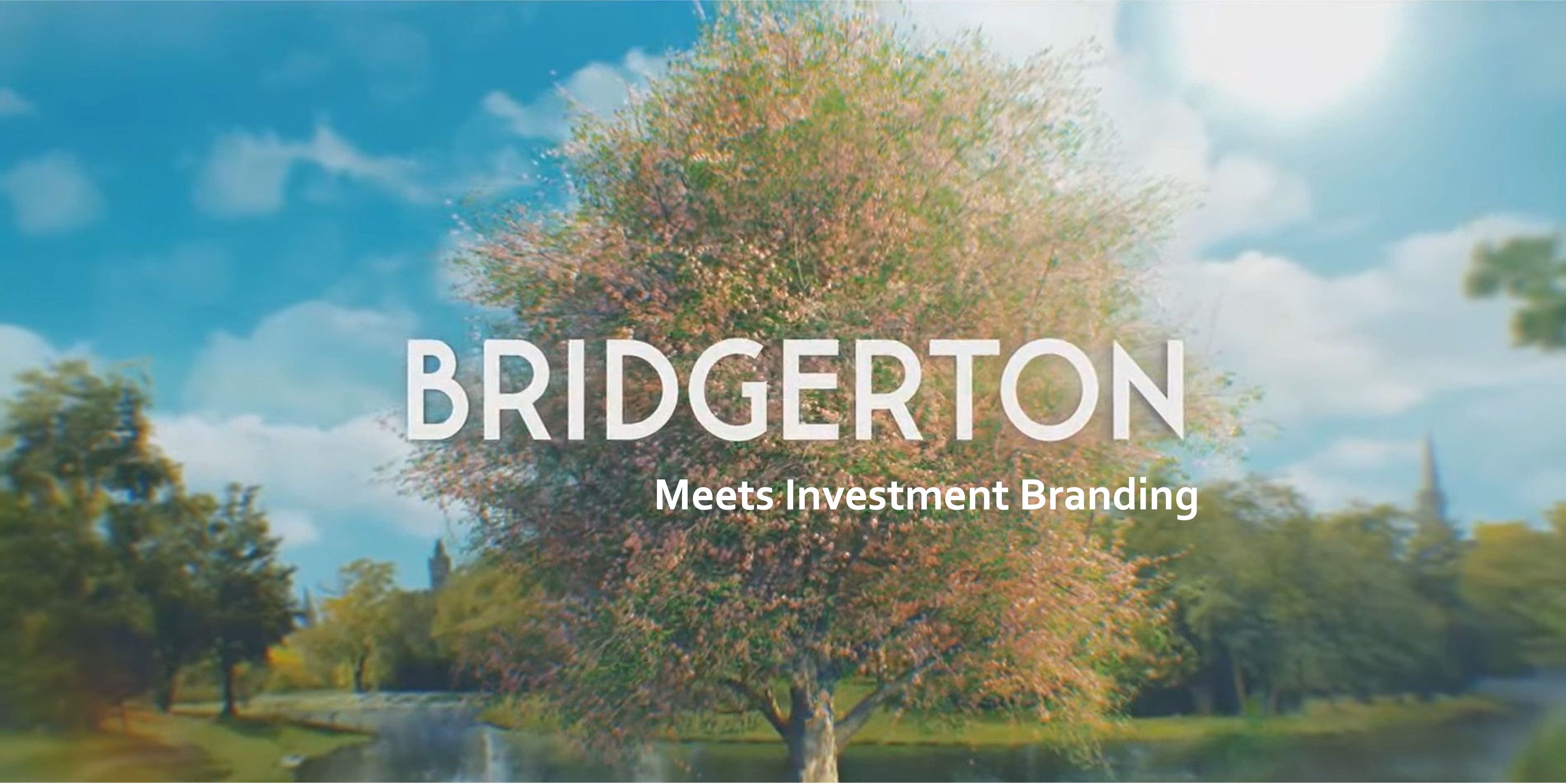
A question I’m sure everyone’s asking.
For those who haven’t jumped on the hype train, Bridgerton is a regency programme with a modern twist. They’ve got pop songs made into classical pieces, their fashion breaks the ‘society rules’ of the times and they’ve embraced a much more culturally forward approach to their casting. It’s set in the 1700’s but purposefully doesn’t adhere to every tradition of the time.
So, how does it relate to investment branding? Well, both stem from a wealth of tradition, rules, regulations and perhaps a slight inclination to ‘keep things the same’. However that’s in the past and today things look very different.
Bridgerton embodies the modern essence whilst nodding to the traditions that have aged well. They aren’t afraid to push the boundaries and create a world where the parts of regency life one enjoys are kept and the parts best left in the past, stay there.
We work with investment brands of all shapes and sizes and one thing I’ve seen being either pioneered by a client striving for something new, or held back by a team more comfortable in the familiar, is change and modernisation.
Refreshing or rebranding to something more contemporary or modernised takes bravery, but doesn’t always need to be as scary as it seems.
Where investment firms hesitating to make change can take a lead from Bridgerton is embracing the new whilst honouring the old. I can think of a number of investment firms who have succeeded in creating a brand that celebrates their often impressively long heritage, whilst also looking forward to the future. They have found the balance between classic and contemporary.
This can be done in various different ways, and you don’t have to use them all. I’ll discuss a few of these suggestions in this article, but “a lady mustn’t reveal all her secrets”, so if you want to go into more detail, please reach out to me by email (e.mould@fininternational.com).
Key tips when looking to modernise your brand, whilst also retaining the traditional elements are;
Font
Please please, do not use overly complicated fonts, it’s hard to read and often fills up a page more than a ‘calmer’ font might. However, that doesn’t mean you need to strip out all style and go for a drastically simplified font. Explore something that’s legible (on and offline). Serifs denote tradition and sans serif typically show modernisation.
A good example of a ‘traditionally modern’ font, I believe, is Lazard Asset Management.
Imagery
Now, this can take a brand from an 8 to a quick 10, if done well – it can also easily go to a 6 or lower if not…
We live in a world where we can pick literally any topic and there almost always is a photo available.TOP TIP: Don’t get carried away with stock imagery (it’s boring).
There are so many ways you can play with imagery to make it more unique, but if you’re going for that ‘historically modern’ approach then I’d take a leaf out of Findlay Park’s imagery, they’ve struck the perfect balance (in my opinion)
Graphics
This is a subtle, yet vital addition to a good brand, and if you’re looking for that modern classic look, then I’d personally take inspiration from Rothschild. They’ve incorporated quite a roman graphic into their website branding and it’s struck a pretty balance between the harsher lines of their imagery.
So, to conclude, if you recognise the need for a change, but sense reluctance or maybe even fear within the team, try likening it to Bridgerton and you may win their hears. Alternatively, if that doesn’t work, please get in touch and we can talk you through refreshing your brand, whilst respecting the history you’ve worked hard to achieve.